
In this article, we will be covering how to use the Portfolio component via the widget. This is part of a series for using the widget feature to host components on your website.
Below are the steps to quickly add the portfolio component to any website.
Step 1. Subscribe to a Skhemata subscription plan
Go to Skhemata’s pricing page and choose the plan that suits you the best. You will be provided with GIT access to the component code. You can also find the full source code for the portfolio component by going here.
Once you have access to the source code, you can then begin to use it in your project. The code linked above is only the source code for the widget. This is the same code that is hosted on the Skhemata CDN with jsdelivr. It is, however, not the widget code itself. That will be provided later in this article.
Step 2. Copy and Paste the widget code
Check out the widget code here. Feel free to copy and paste that HTML widget code into your project to see a working example.
Once that has been added, you can then modify the source code to customize the component for your own use.
Step 3 Customize the component
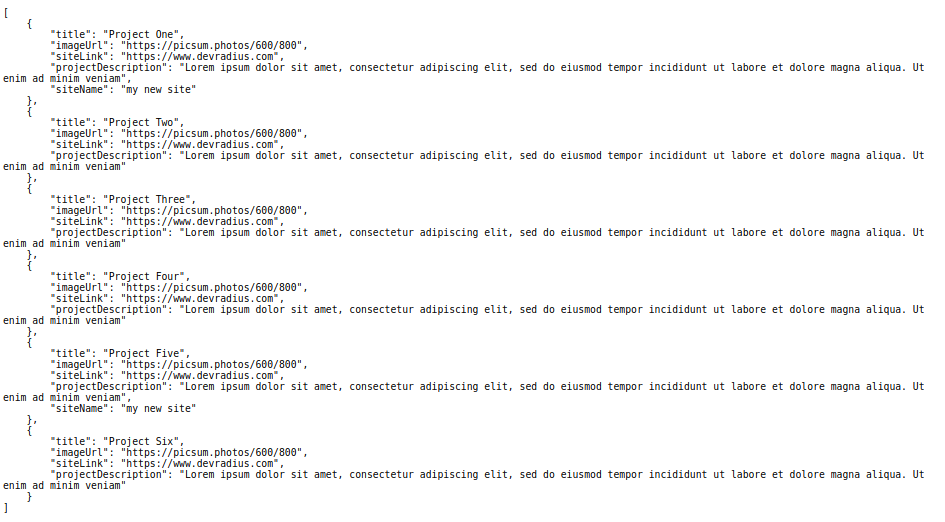
To modify the content, you will need to change the contents as seen in the first link under config-src by default, the link should be the following: https://cdn.jsdelivr.net/npm/@skhemata/skhemata-portfolio@latest/demo/projects.json. Here is what the contents in the file should look like by default:
As you can see, this is the content that is displayed in the widget. You can create and host a new config-src file somewhere, for example, on Github, with your own modifications then reference the file in the widget code.
You have the ability to change the title, placeholder image, redirect URL, site name, and description. If you want to add your own image, you’ll have to host it as well and reference it via a link. The optimal size for images is 800px by 600px.
Simply add your own content as needed. You can also name the file whatever you would like, as long as you reference the correct link in the widget code, it should work.
If you want to style the component further, this is possible using CSS. Check out the different HTML attributes, events, and CSS properties via the Skhemata docs to see what you can manipulate on the widget: https://docs-webcomponent.skhemata.com/?path=/story/general-skhemataportfolio–default
As seen in the Skhemata docs, you can change the background color and the text color for the portfolio cards using the CSS properties. You can play with these colors in the storybook to see how you like them first before adding them to your site. When you are ready, you will have to target these CSS properties on your page in order to see them live on your site.
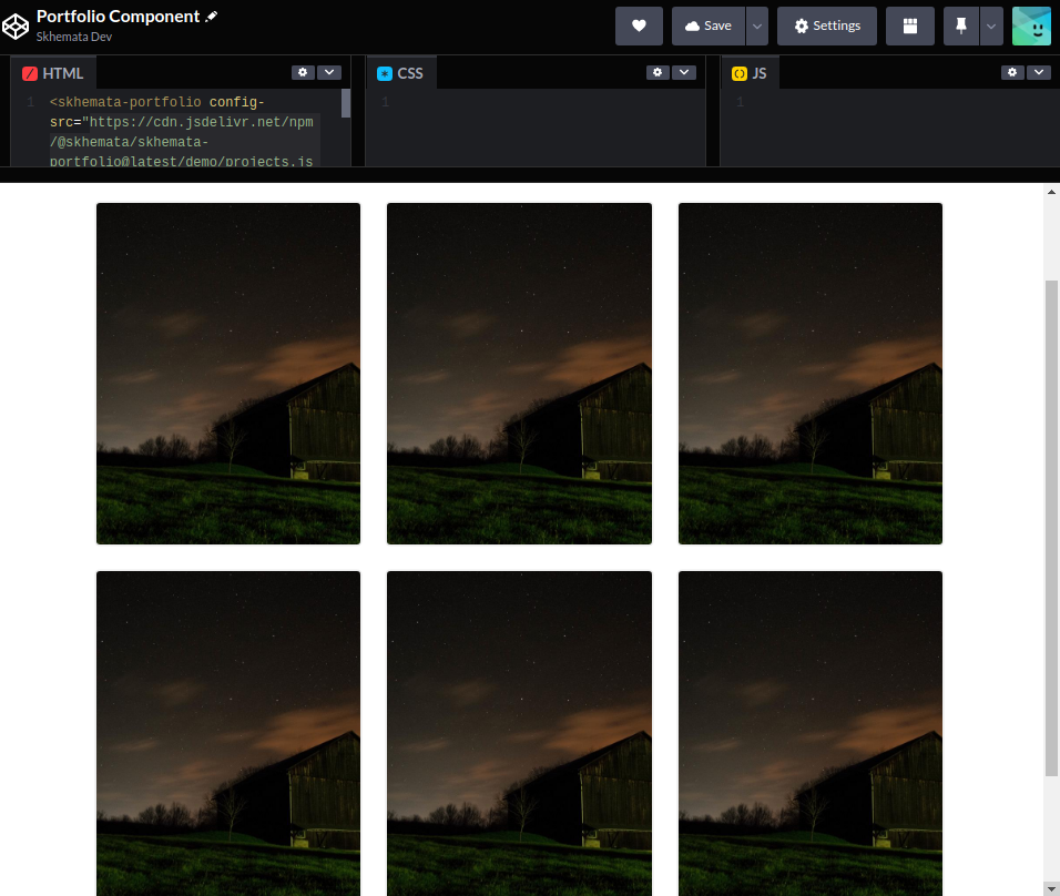
Here is what it could look like in your project:

Further customizations may only be possible if you are importing the entire component into your project rather than using the widget method so you can access and modify the source code directly. Right now, your source code is being delivered through Skhemata’s CDN which you do not have access to.
If you have any questions about how the components work or need help with using them, you can contact Skhemata support on the community Discord chat.