Check out the storybook documentation for Skhemata components. You can now view the component in an isolated environment and the code associated with the component. Take a look by going to the following: https://docs-webcomponent.skhemata.com/
Here’s the documentation to see how you can add and manipulate your component for your project. There are several ways this can be donw. Let’s start by looking at the information that each component comes with in the library. By default, the page will be using the Canvas mode which you can see on the top left of the page. First, there are HTML attributes that can be used to manipulate the look and functionality of each component. There’s an attribute name, and there’s also a control. See the example below for reference.
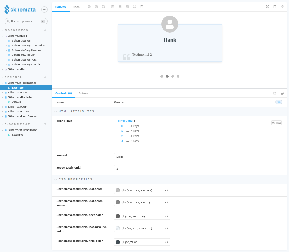
As seen from the testimonial component. There are specific HTML attributes such as config-data, interval, and active-testimonial. You can even update the control for these attributes as an example, to see how the component will function in your application. If you change the interval number, the testimonial will start sliding through each “card” faster or slower depending on the interval that you set. By default, the component will slide through the different testimonials at a specific rate. When you change the interval number, that rate changes as well. The higher you set the interval number, the longer it will display the card before sliding.
Next, let’s take a look at the CSS properties below the HTML attributes. These are some styling updates that you can easily add to the component. Try it out by changing the colors for the different properties and viewing the live changes on Storybook. In addition, you can click on the ‘open canvas in new tab’ icon in the top right corner of the screen.
You may notice that some components will also include an ‘events‘ section under the HTML attributes. Here, you can see the events that can occur inside of the component.
To get more information about the events, attributes, and CSS properties, you can switch to the docs tab at the top left of the page. You will automatically be viewing in the canvas mode by default as mentioned earlier in this article.
For additional changes, you will need to add your own custom code to the component.
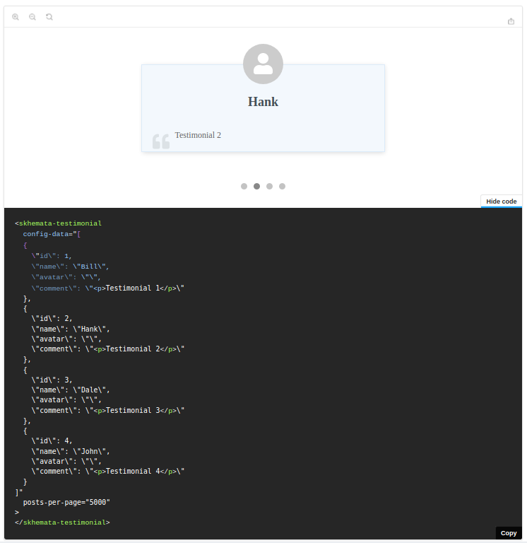
To view the component code, you will need to click on the button at the bottom right corner of the canvas called show code.
Now that you can see the code, what can you do if you want to include the components in your project?
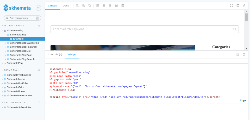
To start, you will need to be signed up for a subscription plan that will suit your needs, after that, you can choose from two different options for embedding the components on your site. Traditionally, you would be importing the component with all of its dependencies into your system and adding the specific component to your page. If this route is complicated or difficult to add to your project, which can happen if you are using a website builder or CMS website, you may want to consider using the widget option instead. In the instance of using the widget, you simply copy and paste a small snippet of HTML code in order to host the component on your site. You can see the widget code by clicking on the widget tab in the canvas as seen in the image below:
There are minor modifications that are required in order for the widget to be hosted with your custom data. To better understand what needs to be modified to show your data, it’s recommended to search for the correct blog article on the Skhemata blog.
If you have any questions about how the components work or need help with using them, you can contact Skhemata support on the community Discord chat.