
Are you interested in adding documentation for your web components? In this article, we will quickly discuss the use of Storybook and how to use it for your web components.
Components can come in different forms. You may want to modularize your application or website in order to offer the same great features among different parts of your website. Using these components, you can easily update your website(s) without having to modify each area individually. Storybook will allow you to create visual documentation for these components. In what is called a story. This just means that you can view the components and their code in a live environment.
In addition, Storybook will also allow you to structure the documentation into subcomponents. Which allows you to group several of the same components together. For example, you may want to offer a navigation component. But not all website navigations are the same, so you may want to create several sub components for the different types of website navigations.
Getting Started
First, you must install Storybook. You can do this via NPM. You can learn more about downloading Storybook here.
Components Parameter
To get started, you will need to use the component parameter. This is used to extract the component’s description and props.
// MyComponent.stories.js | MyComponent.stories.jsx | MyComponent.stories.ts | MyComponent.stories.tsx

import { MyComponent } from './MyComponent';

export default {
title: 'MyComponent',
component: MyComponent,
};
// your templates and stories
Subcomponents parameter
Next, you can add the subcomponents parameter. This can give you different varieties of your component, also known as, subcomponents.
// ButtonGroup.stories.js | ButtonGroup.stories.jsx

import { Button, ButtonGroup } from '../ButtonGroup';

export default {
  title: 'Path/to/ButtonGroup',
  component: ButtonGroup,
  subcomponents: { Button },
};
In the case above, you would be creating subcomponents for the different types of buttons that you want to offer. Here is an example of what such subcomponents would look like as they are grouped together.
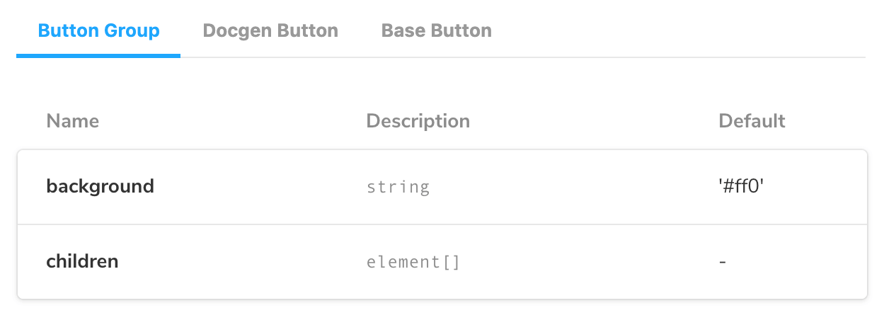
You can see the different tabs that appear by ArgsTables.
That is just the basics for using Storybook. If you want to manipulate it even further, you would need to read the documentation on Storybook here.
The above link will show you how to remove Docs, and use other features of Storybook.